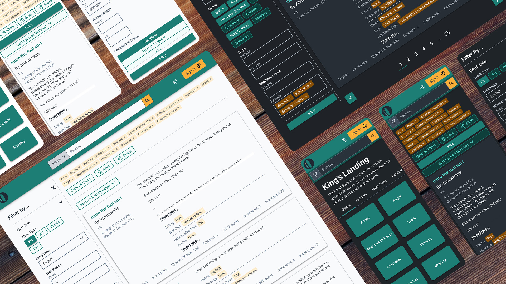
Browsing and Search Overhaul for Fiction Archive
I overhauled the search and browsing experience of a modular fanfiction archive to make it faster for users to find what they want. The new site uses powerful e-commerce style filtering instead of personalized recommendations to better cater to privacy-minded users. Along the way, I gave the site a visual update to improve information hierarchy.
Pilot site for modular archive software
Ideally, Get Ourchive would serve as an example of the software in use that would encourage others to use it to create their own archives. Overall, I designed for the use case of the already existing pilot site, but I kept in mind the ways that future archive administrators might want to customize it for their own use.
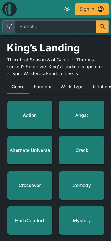
Advertising tropes front and center
Original site
After redesign
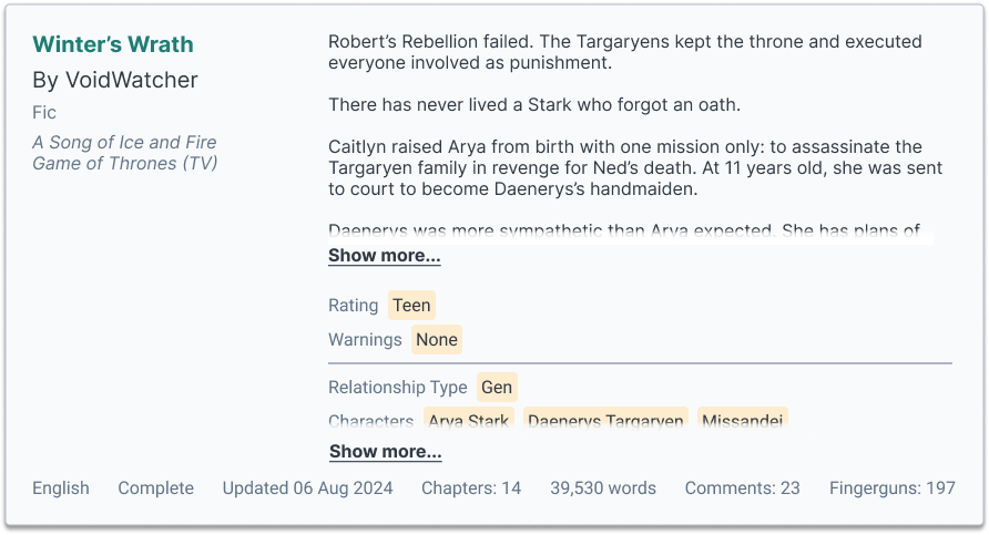
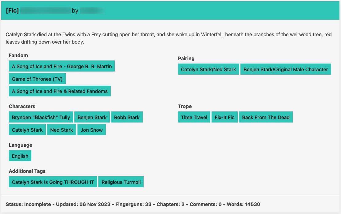
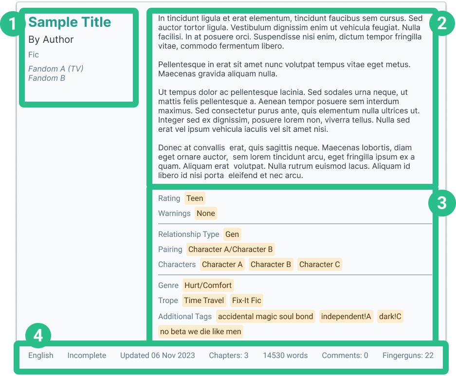
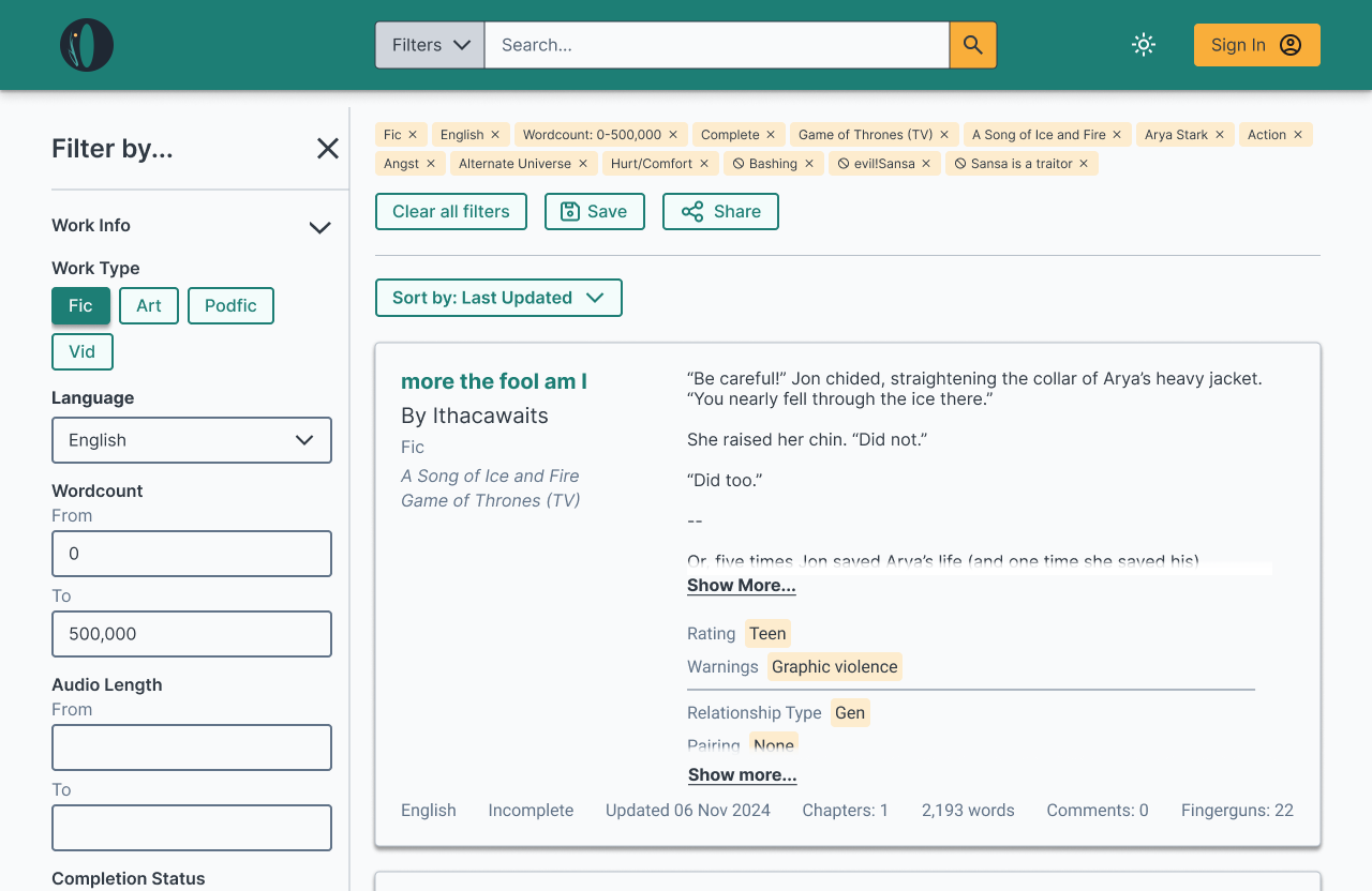
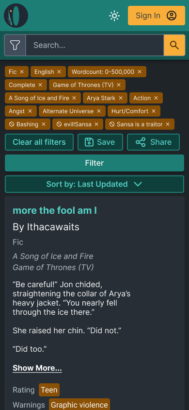
When browsing, each story was displayed in a card that has a summary, content tags, and other metadata associated with it. This helped readers decide if they are interested in reading further. It was important to make this information as easy to parse as possible.
The original site’s story cards made it hard to tell what information was important, and took a lot of vertical space. I wanted to redesign them so that similar information was grouped together. I ran a card sort with 60 users to discover how they felt this information should be organized.
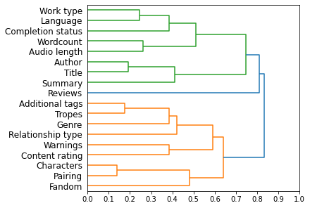
Dendrogram of card sort results
Based on the card sort, I decided on four groups:
- Title, author, work type
- Story summary
- Content tags
- Other metadata
In the pilot site, content tags involved eight different categories that could be broken down into three subgroups: warning level, characters involved, and plot details. Future archive creators who wanted to run their own sites would be allowed to create their own categories and subgroups to be filled in. I made sure to speak to the fullstack engineer about how this would be allowed to happen.
Desktop story card
Mobile story card
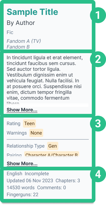
To save on vertical space, I added a “show more” button for both the summary and content tags sections.
Encouraging search and filtering
A major goal in the creation of Get Ourchive was to reduce reliance on algorithmic recommendations in what content to view, for a slower, more thoughtful reading experience. Instead, users were intended to find desired content through applying powerful filters, getting recommendations from other human users, and exercising personal judgement.
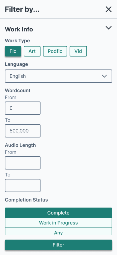
Before, filters could only be accessed through search, effectively hiding it from some users.
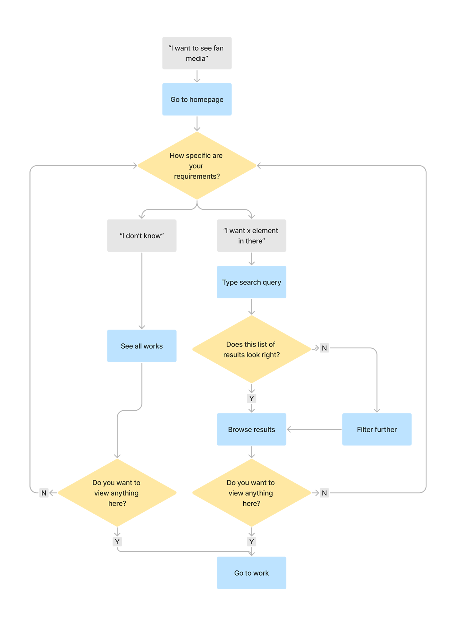
After, filters could be accessed anytime during browsing, increasing their discoverability.
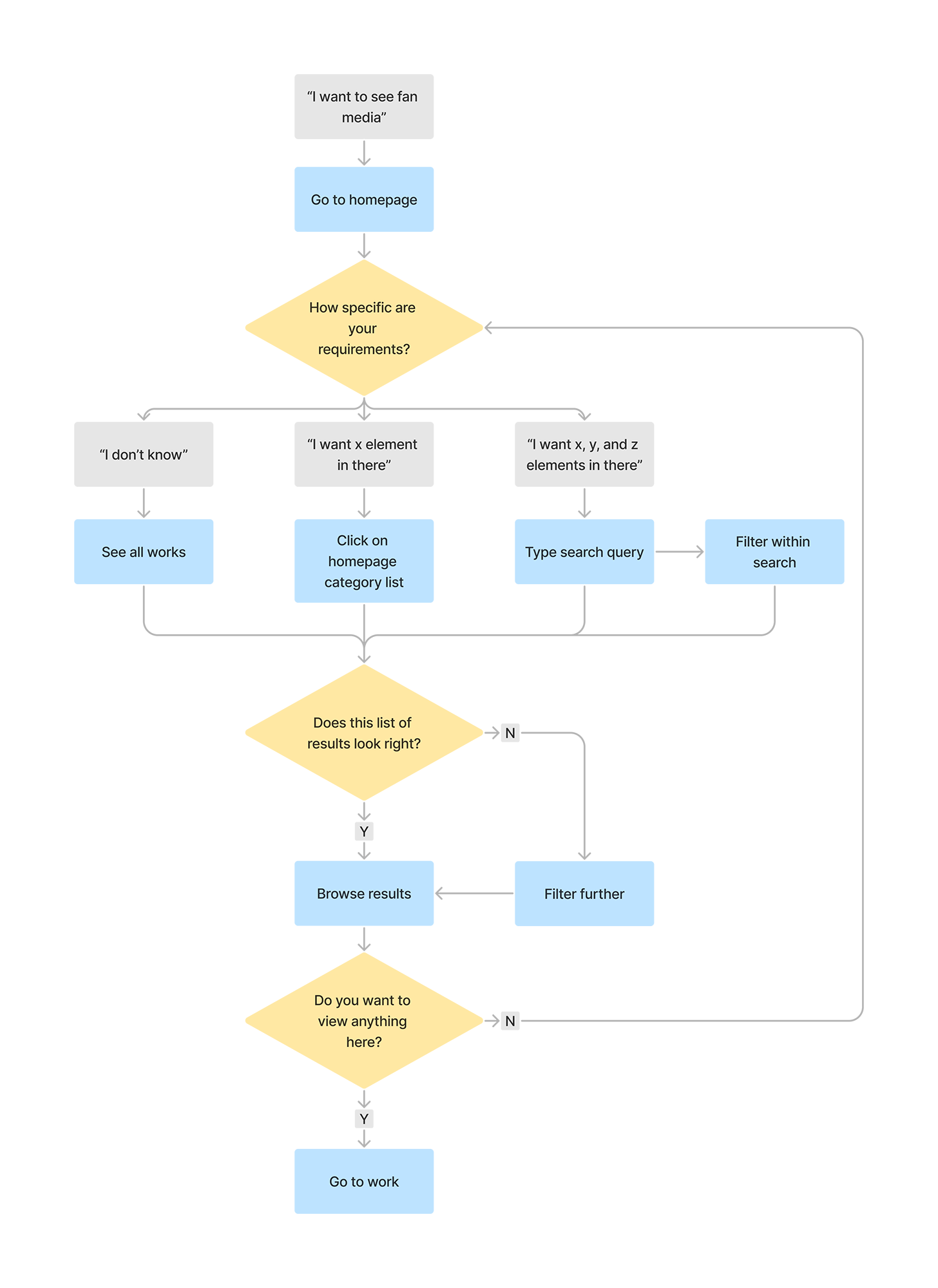
I changed the user flow so that filters would always be available anytime the user looked through a list of stories to read.
In my first round of iteration, I was going to create an advanced search page based on how existing library software and academic databases worked. However, I attended a design talk called "Designing Search UX in 2024" by Vitaly Friedman that gave me some other ideas. Instead of having a separate advanced search page that had to be specifically navigated to, all of that functionality should be directly presented to the user.
I broke up this functionality into two parts: a better searchbar and better filtering sidebar.
Default searchbar

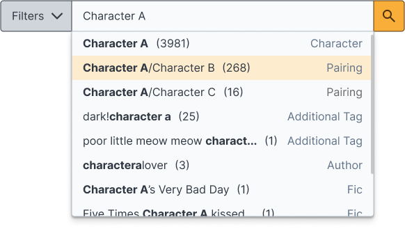
With autocomplete
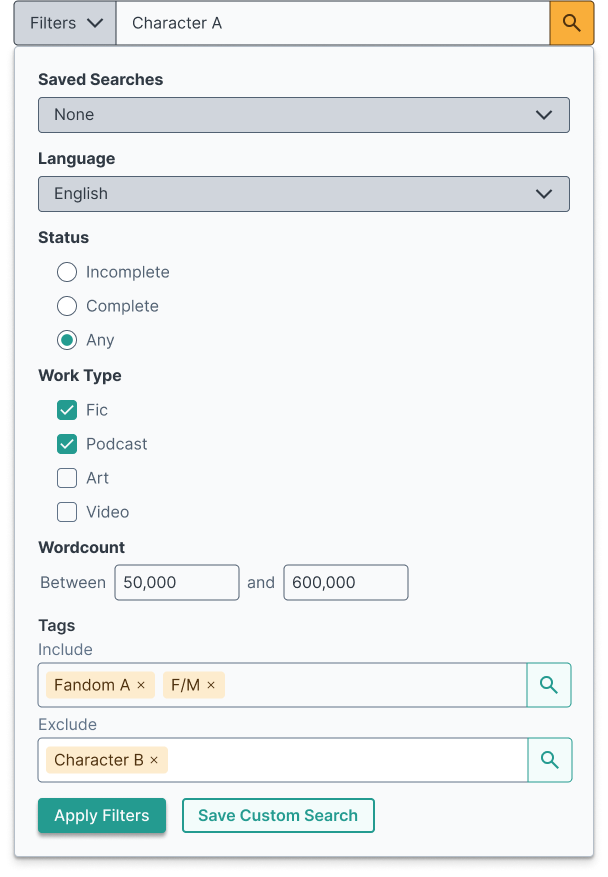
Pre-search filtering
After typing a query

In the original site, it was difficult for users to find stories they wanted through search alone. Autocomplete often suggested wildly different things than what they were looking for, and they had no context why.
I talked to project engineers about autocomplete best practices mentioned in "Designing Search UX in 2024," such as showing what category an autocomplete suggestion fell in. This required significant changes in the backend to achieve, but I persuaded them that the benefit to the user would be worth it.
Additionally, I designed a pre-search filtering widget for power users who already knew exactly what they wanted to find. This acted as a condensed version of the filter sidebar described below.
Before
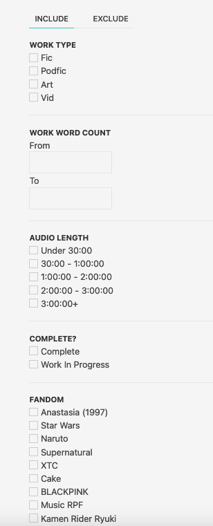
After
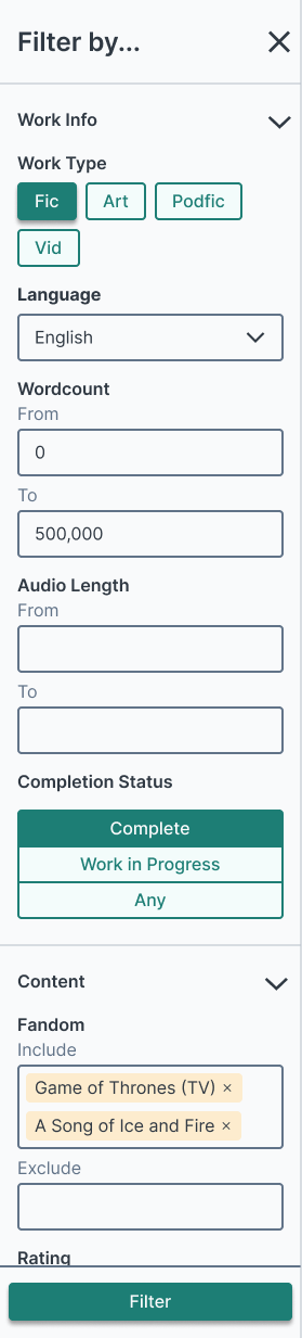
In Ourchive, a category might have a lot of different tags, especially if it allowed users to create their own. Filtering through all of these tags with checkboxes only, which the original site did, wasn’t a scalable solution. Eventually, the checkboxes would take too much vertical space to be useful.
In order to make things appropriately modular, I set out guidelines for three different types of content tag categories, based on how users would input them into the system:
- Write-in text input
- Single selection from set list
- Multiple selection from set list
Tags in premade lists would be filtered using mobile-friendly chips. Tags that were user generated would be filtered using two text input sections, to either include or exclude the typed tags. This, plus the addition of accordions, significantly reduced the amount of vertical space the filtering sidebar needed.
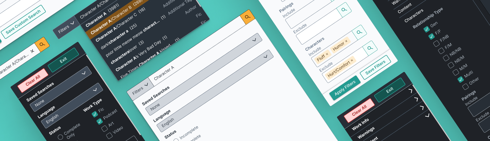
Designs meet reality
I designed the site to do it all: light mode, dark mode, desktop, and mobile.
It turned out that my mockups had too many new parts to push out in the next update, so my designs were split up into multiple parts to work on piece by piece. The new features were moved into the next release, and the new visual design planned for the one after that. At first, it was disappointing not seeing my designs out there immediately, but after seeing how much work was required to make these changes, it was a lot more understandable.
After the first update went out, I discovered that the developers had implemented filtering UI differently than I envisioned. Search parameters weren't being displayed when they should, which made it more difficult for the user to understand how using the filters actually affected which works they saw. In addition, they'd chosen to go with different filtering logic than what I had intended.
Once I realized what the issue was, I sent the developers a message letting them know, with links to other e-commerce sites that had the intended behavior as examples. This helped sort out what the intended behavior should be.
Leveling up teamwork and design skills
In other projects, I had worked before with stakeholders, but this was the first time I had collaborated directly with developers. The more I spoke with them, the more I grew to appreciate how much effort the developers were putting in. It was extremely educational seeing how my mockups were carved up into multiple different Kanban tasks. This helped me get a sense of what realistic progress looks like for development, and the role of a designer post-handoff.
I also improved my skills in Figma. I became much better at using tools like autolayout and variables. I created the beginnings of a design system, with colors, primary and secondary button styling, form input appearance, and more.
Interested in how I can use my design skills to help you? I'd love to chat!